Research
Existing User Journey Map
Recreated the existing user journey from a conversation a customer might have with the call center rep.
Competitive Analysis
Did a deep dive on other similar experiences in the market, so companies like Oscar, Quartz and Penny analyzing their design design principles.
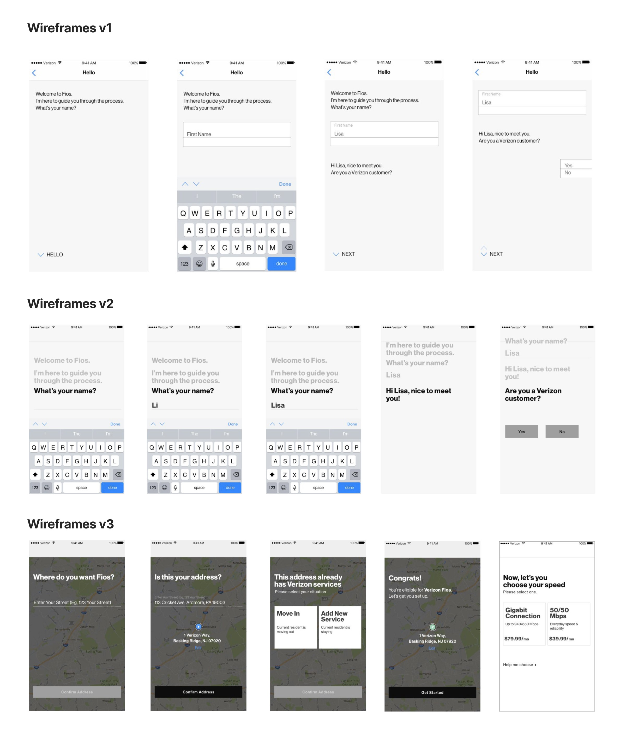
E2E Flow In Person Test Study
Main Objectives:
Watch users as they purchase Internet (E2E Flow)
Find whether the users prefer a conversational interface
Discover the challenges faced by the user
Findings
Users were most successful in reviewing and ordering internet
Users missed certain parts of the conversation as they animated off the screen after a certain duration
Process
User Test: Installation Test Study
Main Objectives:
Find the easiest and quickest way for the user to schedule an appointment
Find whether the UI is intuitive and usable
Discover the challenges faced by the user to schedule the appointment
Findings
Users preferred the monthly calendar grid view over the weekly view
The UI to select time slots was equally understood in all cases
A secondary confirmation CTA (‘Book appointment’) was needed
High Fidelity Designs
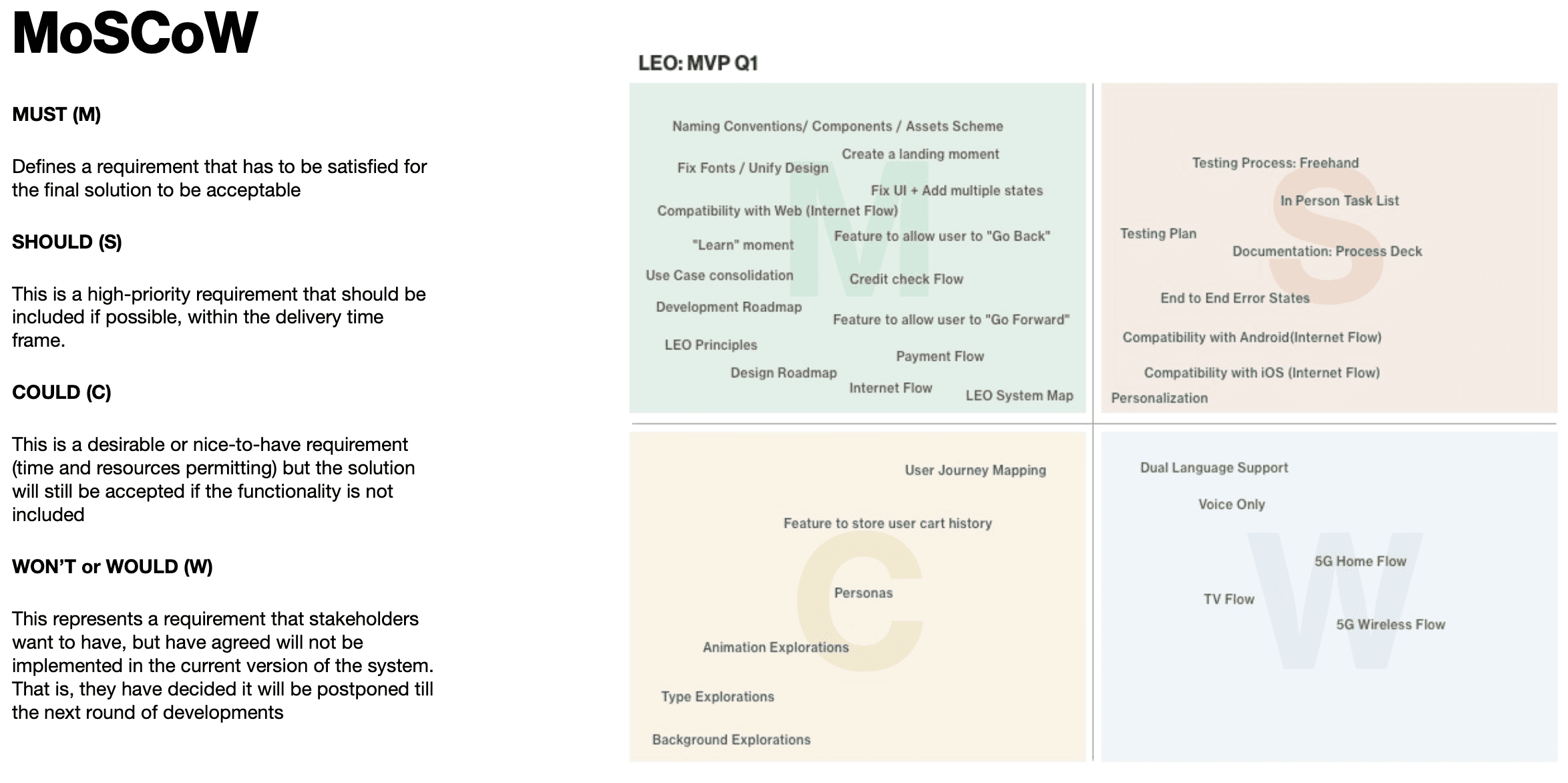
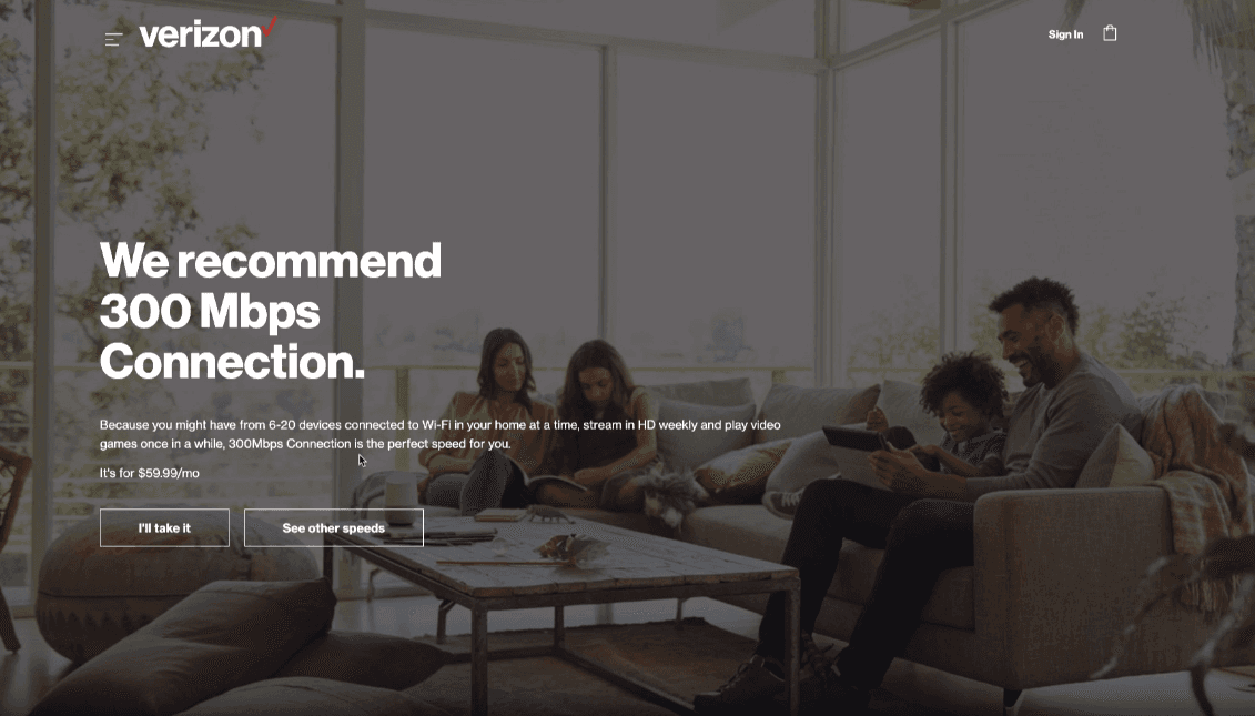
In our high fidelity designs we wanted to focus on creating a delightful + personalized experience, based on our customers data, to save users from repeating unnecessary interactions and creating a faster customer journey with less friction.
These were our 3 core requirements.
Human
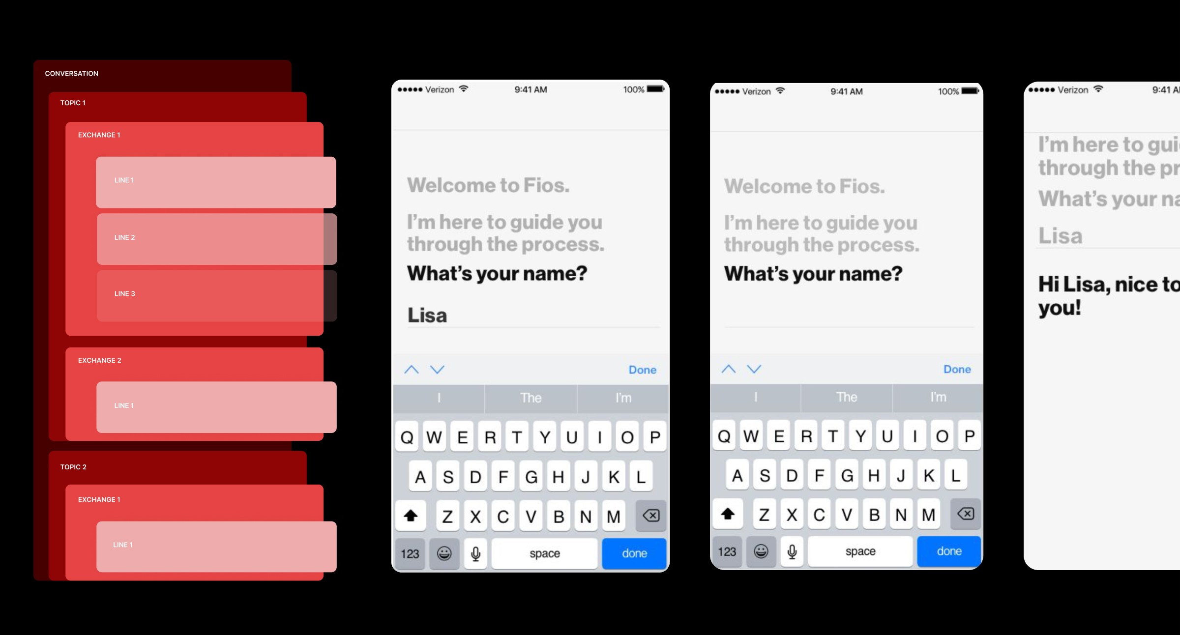
The conversation is natural and organic. All of our services were designed with conversation in mind.
It’s designed to foster a personal connection between services and
their users.
Intentional
The conversation dynamically adapts to the customer’s needs. Focusing on creating a personalized experience, based on user data, to reduce the workload between users and conversions.
Dynamic
By making the platform modular we were are able create conversation that is not required to be linear. At any part in the process a customer can choose where the conversation goes.
